

Introduction:
Colors are an integral part of our daily lives, from the clothes we wear to the products we use. They have the power to evoke emotions, create moods, and influence our behavior. In the world of design, colors play a crucial role in creating visually appealing and effective projects. Choosing the right color palette is essential as it can make or break the success of a design. In this article, we will explore the importance of selecting the right color palette and how it can impact your next smartphone.
What is a Color Palette?
A color palette is a collection of colors that are carefully selected and used together to create a cohesive and harmonious scheme. It typically consists of a primary color, which is the dominant hue, along with secondary and tertiary colors that complement and enhance the primary color. The choice of colors, their proportions, and their arrangement within the palette are crucial in achieving a specific aesthetic or conveying a particular message.
The Psychology of Colors:
Before delving into the importance of choosing the right color palette, it is essential to understand the psychology of colors. Different colors have different meanings and can evoke various emotions and associations. Here are some common associations with different colors:
- Red: Energy, passion, excitement, and danger.
- Orange: Warmth, creativity, and enthusiasm.
- Yellow: Happiness, optimism, and warmth.
- Green: Nature, growth, and harmony.
- Blue: Calmness, trust, and stability.
- Purple: Royalty, luxury, and spirituality.
- Pink: Femininity, love, and compassion.
- Black: Elegance, sophistication, and mystery.
- White: Purity, cleanliness, and simplicity.
These associations may vary depending on cultural and personal experiences, but they provide a general understanding of how colors can affect our emotions and perceptions.
Why is Choosing the Right Color Palette Important?
- Evokes Emotions and Establishes a Mood:
As mentioned earlier, colors have the power to evoke emotions and create specific moods. In design, this is crucial as it can influence how people perceive and interact with a product or brand. For example, if you want to create a sense of energy and excitement for your smartphone, using warm colors like red and orange in your color palette would be more effective than cool colors like blue and green.
- Enhances Brand Identity:
Colors are an essential element of branding. They can help establish a brand’s identity and differentiate it from its competitors. A well-chosen color palette can make a brand more recognizable and memorable. Take, for example, the iconic red and white color scheme of Coca-Cola or the vibrant rainbow colors of Google. These color palettes have become synonymous with their respective brands and have helped them stand out in a crowded market.
- Improves Visual Appeal:
A well-curated color palette can significantly enhance the visual appeal of a design. Colors that complement each other and are used in the right proportions can create a harmonious and eye-catching composition. On the other hand, using clashing colors or too many colors can make a design look chaotic and unappealing. When it comes to smartphones, which are often seen as a fashion statement, having a visually appealing color palette can attract potential buyers and make your product stand out.
- Communicates a Message:
Colors can also be used to convey a message or represent a particular idea or concept. For example, green is often associated with environmentalism and sustainability, while pink is commonly used to support breast cancer awareness. By incorporating these colors into a color palette, a brand can communicate its values and beliefs to its audience without saying a word.
- Consistency Across Platforms:
In today’s digital age, it is essential to have consistency across different platforms and devices. This includes having a consistent color palette for your brand or product. By using the same colors across all platforms, you can create a cohesive and recognizable brand image, which can help build trust and loyalty among consumers.
- Accessibility:
Choosing the right color palette is not just about aesthetics; it is also about accessibility. For people with color blindness or other visual impairments, certain color combinations may be difficult to distinguish. It is crucial to consider accessibility when selecting a color palette to ensure that your design is inclusive and can be enjoyed by everyone.
The Coolest Color Palette for Your Next Smartphone:
Now that we have established the importance of choosing the right color palette let’s explore some of the coolest color palettes for your next smartphone. These color palettes are based on current trends and consumer preferences and can help make your smartphone stand out in the market.
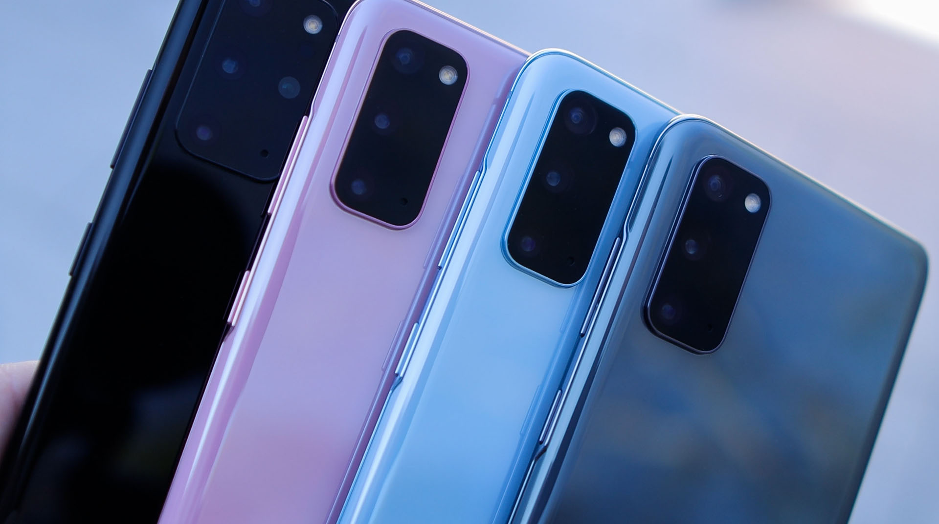
1. Pastel Perfection:
Pastel colors have been trending in the world of fashion and design for quite some time now, and they are making their way into the world of smartphones as well. Soft shades of pink, blue, and green can create a calming and sophisticated color palette for your device. This color palette would appeal to those who prefer a more subtle and understated look for their smartphone.
| Primary Color | Secondary Color | Tertiary Color |
|---|---|---|
| Light Pink | Sky Blue | Mint Green |
2. Bold and Bright:
For those who like to make a statement with their smartphone, a bold and bright color palette is the way to go. Vibrant hues like red, orange, and yellow can create an energetic and eye-catching color scheme. This color palette would appeal to a younger audience and those who want their smartphone to reflect their outgoing and fun personality.
| Primary Color | Secondary Color | Tertiary Color |
|---|---|---|
| Red | Orange | Yellow |
3. Monochromatic Magic:
Monochromatic color palettes have been gaining popularity in the design world, and they can also work well for smartphones. This color scheme involves using different shades of the same color to create a cohesive and elegant look. For example, a monochromatic blue color palette would include various shades of blue, such as navy, sky blue, and baby blue.
| Primary Color | Secondary Color | Tertiary Color |
|---|---|---|
| Navy Blue | Sky Blue | Baby Blue |
4. Metallic Marvels:
Metallic colors like gold, silver, and rose gold have become increasingly popular in smartphone designs. These colors add a touch of luxury and sophistication to any device. A metallic color palette can also include other colors like black or white to create a more balanced and visually appealing composition.
| Primary Color | Secondary Color | Tertiary Color |
|---|---|---|
| Gold | Silver | Black |
5. Nature’s Palette:
Nature has always been a source of inspiration for designers, and it is no different when it comes to color palettes for smartphones. Shades of green, brown, and blue can create a calming and earthy color scheme that would appeal to those who love the outdoors and want their smartphone to reflect that.
| Primary Color | Secondary Color | Tertiary Color |
|---|---|---|
| Forest Green | Earth Brown | Ocean Blue |